QULIPTA
Client
AbbVie Product Marketing Team
My Role
Lead UX Designer
Industry
Pharma
QULIPTA
Client
AbbVie Product Marketing Team
My Role
Lead UX Designer
Industry
Pharma

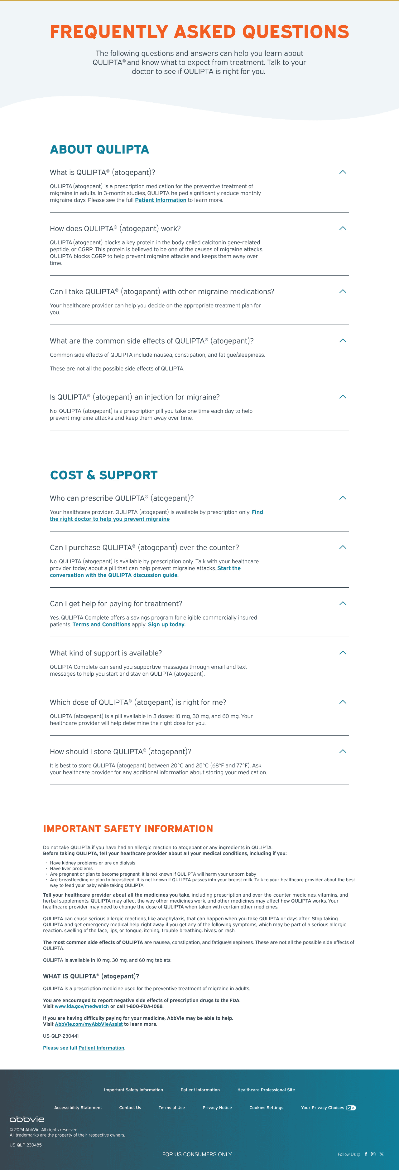
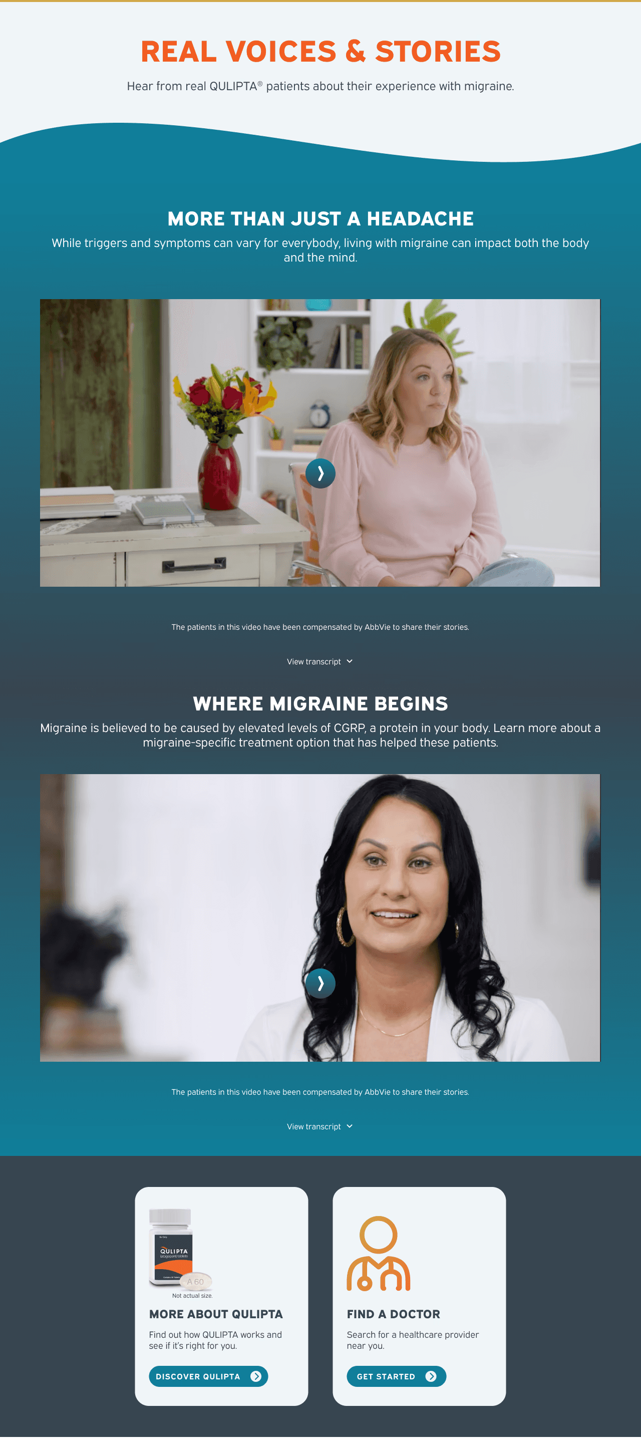

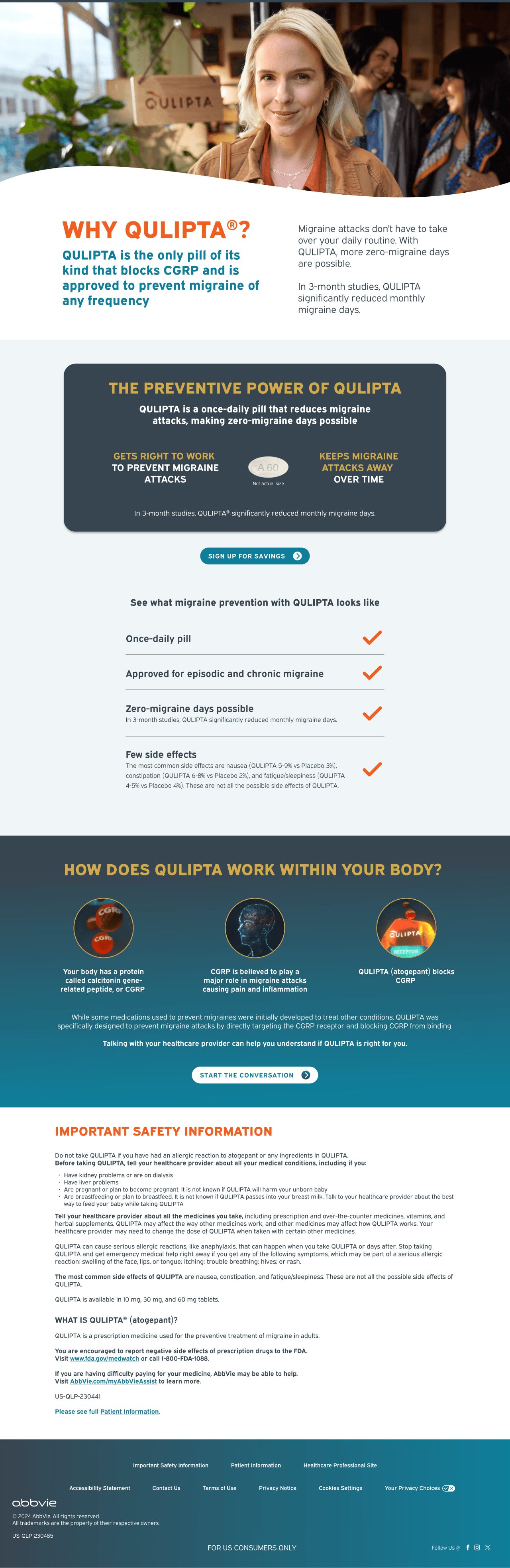
QULIPTA
Client
AbbVie Product Marketing Team
My Role
Lead UX Designer
Industry
Pharma
Overview.
Overview.
The Product
The Product
QULIPTA is a prescription medication designed to help prevent episodic migraines, offering patients a once‑daily oral treatment option. As a pharmaceutical brand operating in a highly regulated digital landscape, its website plays a critical role in shaping patient understanding, supporting informed conversations with healthcare providers, and guiding users through complex medical information with clarity and empathy.
QULIPTA is a prescription medication designed to help prevent episodic migraines, offering patients a once‑daily oral treatment option. As a pharmaceutical brand operating in a highly regulated digital landscape, its website plays a critical role in shaping patient understanding, supporting informed conversations with healthcare providers, and guiding users through complex medical information with clarity and empathy.
The Ask
The Ask
AbbVie came to us after running ADA compliance tests on the original QULIPTA website and it falling short in almost every category. The ask was simple, "Increase the score".
AbbVie came to us after running ADA compliance tests on the original QULIPTA website and it falling short in almost every category. The ask was simple, “Increase the score”.
AbbVie came to us after running ADA compliance tests on the original QULIPTA website and it falling short in almost every category. The ask was simple, “Increase the score”.
The Approach.
The Approach.
Initially the ask was quite broad. So, before making any quick decisions I wanted to get a full picture of the site and its ecosystem. I audited based on things like accessibility standards, UX best practices, visual design, information architecture, and content hierarchy. I pulled site analytics, marketing data, and reviewed competitors to make more informed recommendations.
Initially the ask was quite broad. So, before making any quick decisions I wanted to get a full picture of the site and its ecosystem. I audited based on things like accessibility standards, UX best practices, visual design, information architecture, and content hierarchy. I pulled site analytics, marketing data, and reviewed competitors to make more informed recommendations.
I found that while successful as a treatment, analytics showed the digital experience was lacking. The original site had deep rooted issues that simple fixes would not solve, it needed a redesign.
I found that while successful as a treatment, analytics showed the digital experience was lacking. The original site had deep rooted issues that simple fixes would not solve, it needed a redesign.


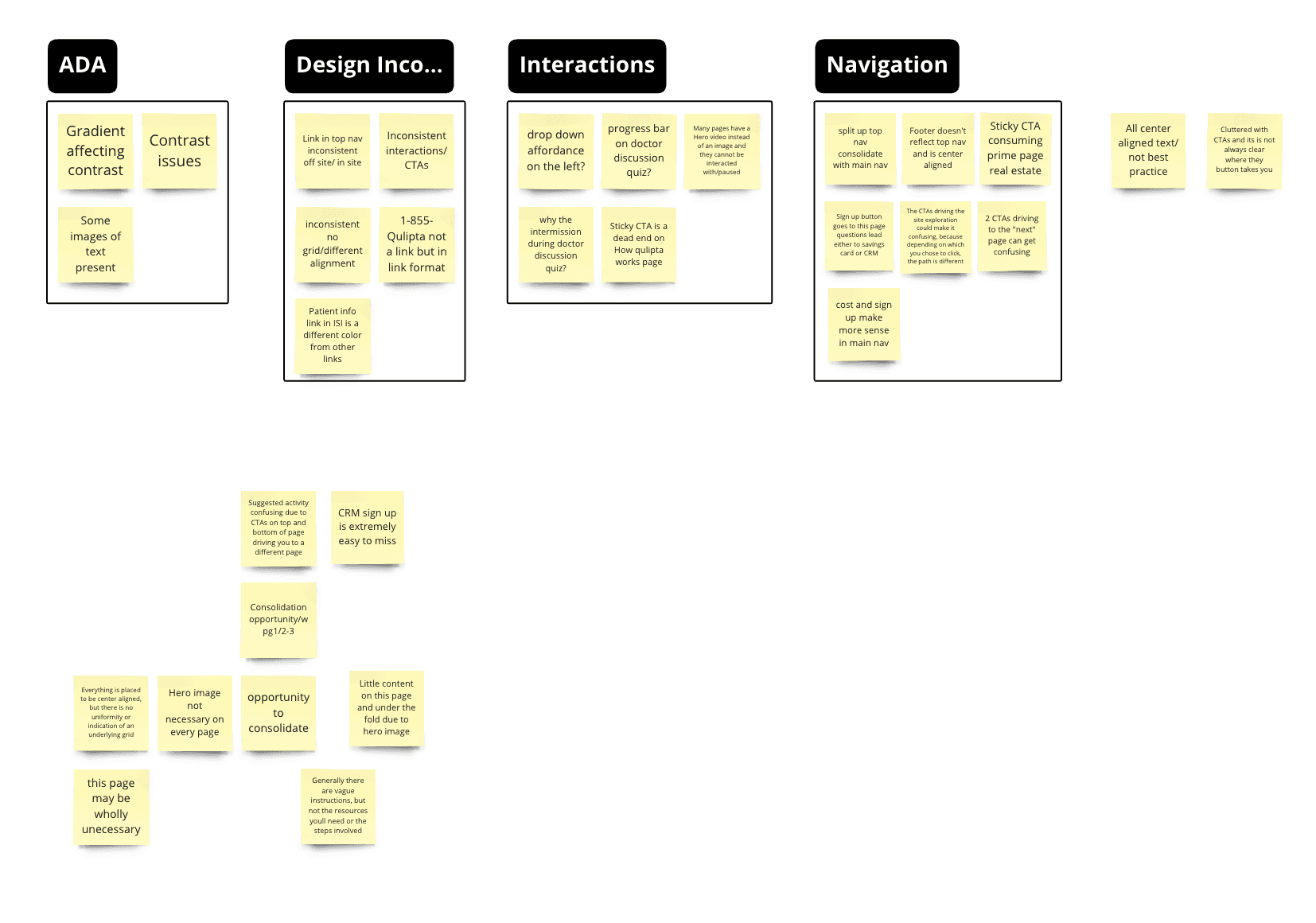
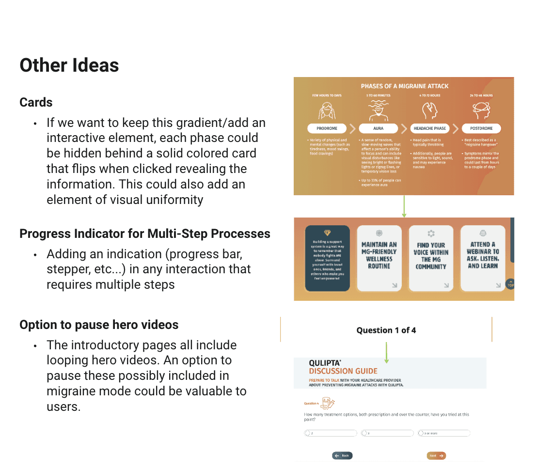
Initial discovery: Heuristic audit findings and early presentation notes
Initial discovery: Heuristic audit findings and early presentation notes
Presenting Our Findings
Presenting Our Findings
After our assessment, we were able to create an initial list of recommendations outlining the the future vision of the site. We honed in on increasing accessibility, providing more educational value, and building user trust. I knew that small updates would not cut it to meet the business goals and user needs. I presented the findings and suggested to clients that we do a full site redesign with updated navigation, information architecture, visual design, hierarchy, and focusing on our patient consumers as migraine sufferers.
Two weeks after the presentation we got a greenlight to start a full redesign.
After our assessment, we were able to create an initial list of recommendations outlining the the future vision of the site. We honed in on increasing accessibility, providing more educational value, and building user trust. I knew that small updates would not cut it to meet the business goals and user needs. I presented the findings and suggested to clients that we do a full site redesign with updated navigation, information architecture, visual design, hierarchy, and focusing on our patient consumers as migraine sufferers.
Two weeks after the presentation we got a greenlight to start a full redesign.
Where to Focus?
Where to Focus?
1.
Brand Identity
Brand Identity
Many of the accessibility issues on the original site stemmed from the use of brand color gradients, brand imagery like images of text and inaccessible text over images, text colors that did not meet contrast standards, etc. We needed to make sure to keep QULIPTA's brand identity while revamping the style to create an accessible experience.
Many of the accessibility issues on the original site stemmed from the use of brand color gradients, brand imagery like images of text and inaccessible text over images, text colors that did not meet contrast standards, etc. We needed to make sure to keep QULIPTA’s brand identity while revamping the style to create an accessible experience.
2.
Navigation & Wayfinding
Navigation & Wayfinding
The original navigation and wayfinding features were difficult to use. There were important pages that could not be accessed through the main navigation and the CTAs didn’t consider a cohesive user journey.
The original navigation and wayfinding features were difficult to use. There were important pages that could not be accessed through the main navigation and the CTAs didn’t consider a cohesive user journey.
3.
Mobile-First
Mobile-First
Analytics data showed that a majority of the site traffic came from mobile devices. We needed to make sure that the experience was consistent and valuable on a screen sizes.
Analytics data showed that a majority of the site traffic came from mobile devices. We needed to make sure that the experience was consistent and valuable on a screen sizes.
Solutions.
Solutions.
Visual Overhaul
Visual Overhaul
We would remedy many of the sites visual accessibility issues by implementing best practices such as eliminating pictures of text, reevaluating color contrast throughout, reimagining the visual campaign, prioritizing text clarity, recommending proper content ordering in HTML, and making sure that alt text was in the code where necessary. We also introduced the migraine mode feature, a toggled alternative color scheme tailored to decrease eyestrain as a migraine trigger. This mode would also stop video, audio, and gifs from auto-playing throughout the site.
We would remedy many of the sites visual accessibility issues by implementing best practices such as eliminating pictures of text, reevaluating color contrast throughout, reimagining the visual campaign, prioritizing text clarity, recommending proper content ordering in HTML, and making sure that alt text was in the code where necessary. We also introduced the migraine mode feature, a toggled alternative color scheme tailored to decrease eyestrain as a migraine trigger. This mode would also stop video, audio, and gifs from auto-playing throughout the site.
Navigation & Wayfinding
Navigation & Wayfinding
A navigation rework that would include the consolidation of pages with respect to duplicative content and improved content hierarchy. With this rework we saw the opportunity to create a wayfinding module to ensure users could quickly access the content they needed quickly and easily. This feature would ask one simple question and output a suggested page to visit based on where the user is in their migraine journey.
A navigation rework that would include the consolidation of pages with respect to duplicative content and improved content hierarchy. With this rework we saw the opportunity to create a wayfinding module to ensure users could quickly access the content they needed quickly and easily. This feature would ask one simple question and output a suggested page to visit based on where the user is in their migraine journey.
Mobile-First
Mobile-First
Enhancing the mobile experience by designing mobile-first. Many existing and new features were rebuilt to have value on both desktop and mobile
Enhancing the mobile experience by designing mobile-first. Many existing and new features were rebuilt to have value on both desktop and mobile


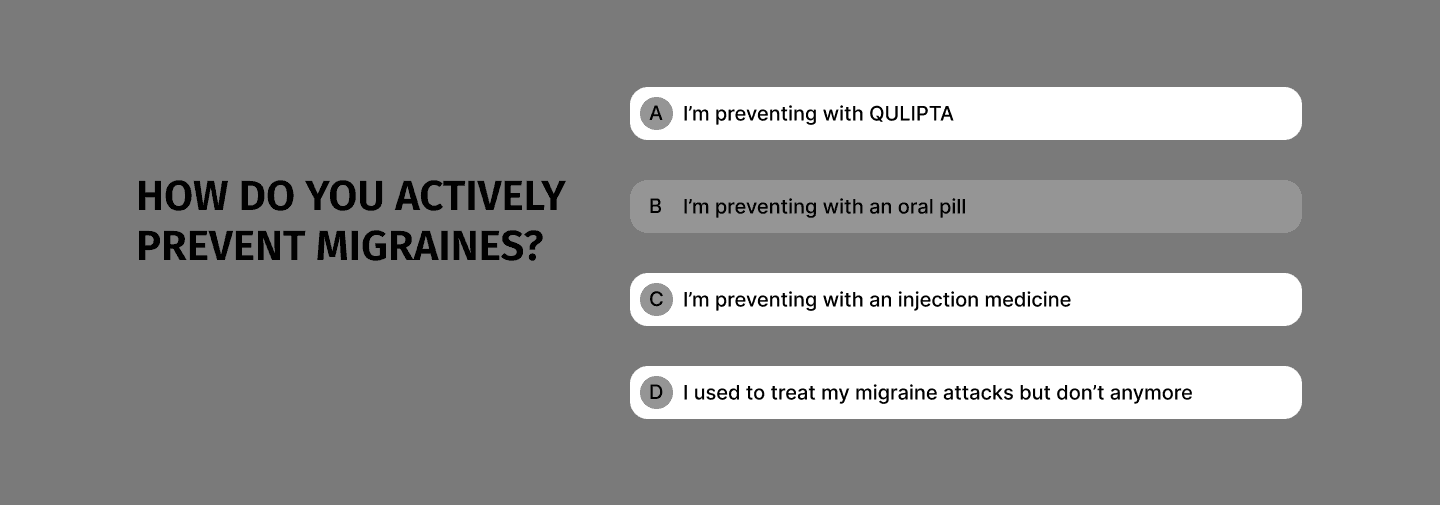
Ideation: Early wireframes of proposed features
Wireframe Development.
Wireframe Development.
To remedy the site’s ADA compliance issues, we involved the UI team very early in this project. When designing components, we collaborated to make sure that they made sense with the style and schemes that were most important to QULIPTA’s brand Identity. We created a design system that was much more cohesive both functionally and visually.
The navigation of the site was fully revamped. We consolidated pages where necessary so that each page provided more value to users. We also made sure that all pages were easily accessible through the main navigation.
We included interactive features such as quizzes to help with wayfinding, and a doctor discussion guide to assist user with conversations with their healthcare provider.
To remedy the site’s ADA compliance issues, we involved the UI team very early in this project. When designing components, we collaborated to make sure that they made sense with the style and schemes that were most important to QULIPTA’s brand Identity. We created a design system that was much more cohesive both functionally and visually.
The navigation of the site was fully revamped. We consolidated pages where necessary so that each page provided more value to users. We also made sure that all pages were easily accessible through the main navigation.
We included interactive features such as quizzes to help with wayfinding, and a doctor discussion guide to assist user with conversations with their healthcare provider.


Early wireframes of the revamped site structure.
Difficulties & Setbacks
Difficulties & Setbacks
After handing off the wireframes to the UI design team, I continued to oversee UX and inform design decisions. Later in the UI process, the AbbVie team came back to us with concerns that they’re branding wasn’t being fully expressed in the first iteration of design. I, then, ran a workshop with both the UI team and the AbbVie product team to align and find out what design and brand elements they felt were missing. This made it clear that we were going to have some trade-offs. While the client did not want to give up many of the gradients, we still had migraine mode to mute the colors and offer a more accessible experience. In future iterations, this workshop allowed us to come to a design that satisfied the user and met the client's primary business goals.
After handing off the wireframes to the UI design team, I continued to oversee UX and inform design decisions. Later in the UI process, the AbbVie team came back to us with concerns that they’re branding wasn’t being fully expressed in the first iteration of design. I, then, ran a workshop with both the UI team and the AbbVie product team to align and find out what design and brand elements they felt were missing. This made it clear that we were going to have some trade-offs. While the client did not want to give up many of the gradients, we still had migraine mode to mute the colors and offer a more accessible experience. In future iterations, this workshop allowed us to come to a design that satisfied the user and met the client’s primary business goals.
After handing off the wireframes to the UI design team, I continued to oversee UX and inform design decisions. Later in the UI process, the AbbVie team came back to us with concerns that they’re branding wasn’t being fully expressed in the first iteration of design. I, then, ran a workshop with both the UI team and the AbbVie product team to align and find out what design and brand elements they felt were missing. This made it clear that we were going to have some trade-offs. While the client did not want to give up many of the gradients, we still had migraine mode to mute the colors and offer a more accessible experience. In future iterations, this workshop allowed us to come to a design that satisfied the user and met the client’s primary business goals.

Miro board where we held our workshopping session with the client team
Miro board where we held our workshopping session with the client team
Impact
Impact
Increased
Accessibility Scores
Increased
User
Time-on-site
Decreased
Page load Times



End
Always Learning.
I always say my biggest strength in this craft is curiosity. I’m always either upskilling or just trying to learn something new with a new book, tool, or class. In any project I work on I bring a true curiosity and I can’t wait to see what rabbit hole I get to jump down next.
I’m always looking for my next project where I can solve real world problems. Let’s Connect!
End